What Happened to Apple's Legendary Attention to Detail?
designIn my mind, "Apple" as a brand used to be synonymous with "attention to detail" but sadly, over the course of the last 8 - 10 years, their choices have become anything but detail oriented.
This year, things have gotten so bad that I'm starting to think they've stopped caring about user experience, accessibility, and detailed QA tests altogether.
I'd rather write less and show you more. So let's go through a couple of examples that made me feel heartbroken and eventually made me stop using some Apple products.
Reminders App on Mac OS
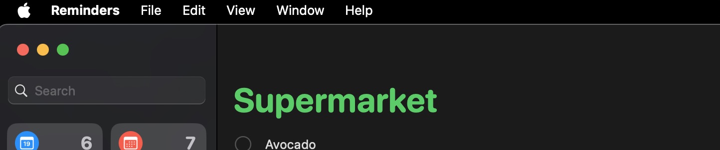
If you are privacy conscious like me, and don't give the Reminders app permission to access your location, it will ask you for location permissions every single damn time you launch it. Need to remember something while you're in the flow? Forget about it, this popup will steal your keyboard's focus. Need to check an item off your list? nope. not today, give permissions.
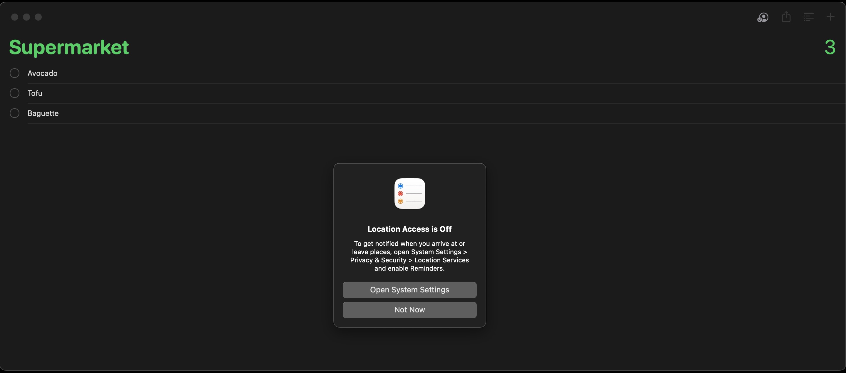
For a company that over-uses the word "privacy" in all their presentations, why are these my only two options? "Open System Settings" and "Not Now"?
Whatever happened to "Don't Ask Me Again"?
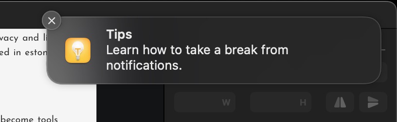
I thought perhaps if I update Mac OS X this would go away, but I was wrong. Not only that popup's here to stay, this time I was interrupted with the most ironic notification:
Taking a break from notifications
Would you like to take a break from notifications? Click this ironic notification popup.
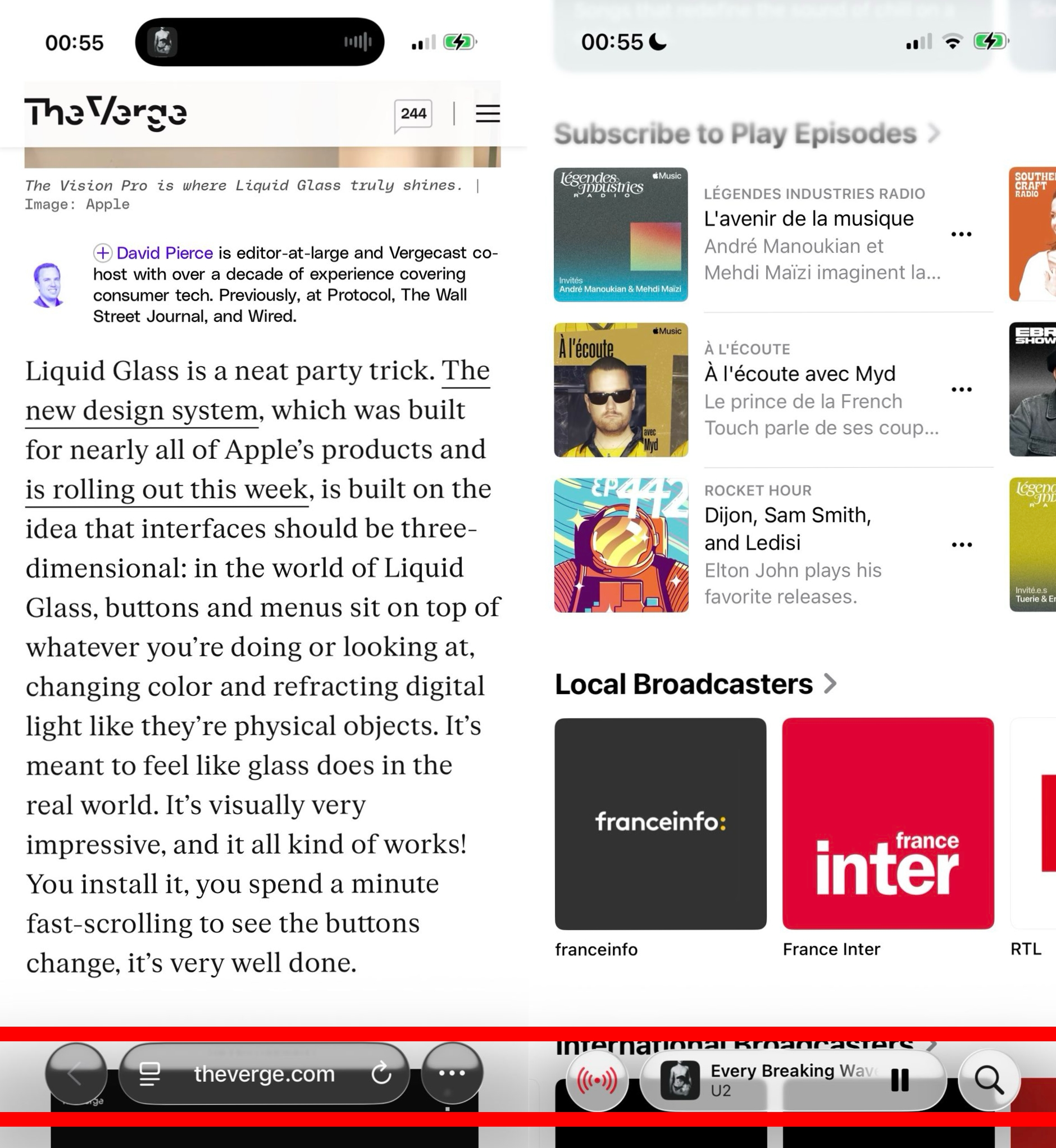
Searching for the search bar
The talented folks in Cupertino can't seem to decide where to put the search bar in their apps. So if you're trying to search for something, you first have to search for the search bar itself.
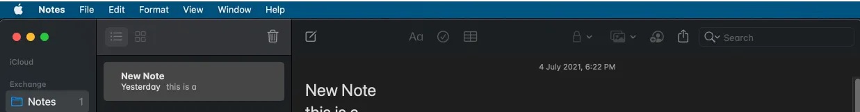
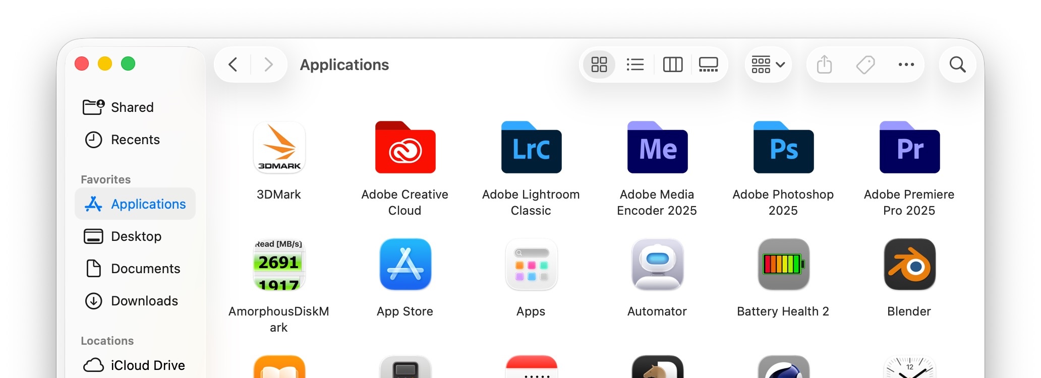
In Finder and Notes, the search box is at the top right :
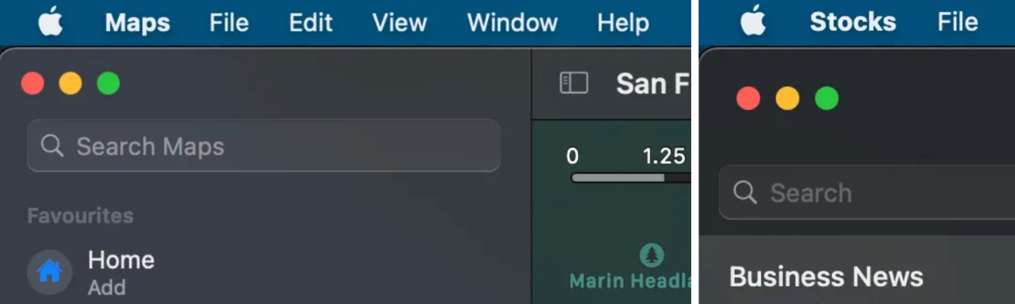
In Maps, Stocks, and Reminders the search box is at the top left :
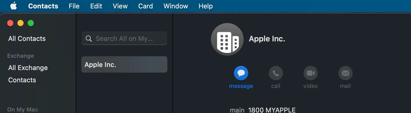
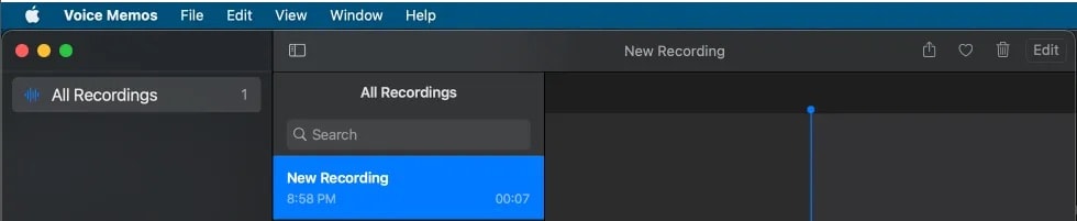
In Contacts and Voice Memo, the search box is at the top of the middle pane :
What's a tab?
For some reason, Mac OS X doesn't have a standard and consistent design for tabs.
Apps like Dictionary and Keychain have tabs below the top bar, in a separate row, using a smaller font :


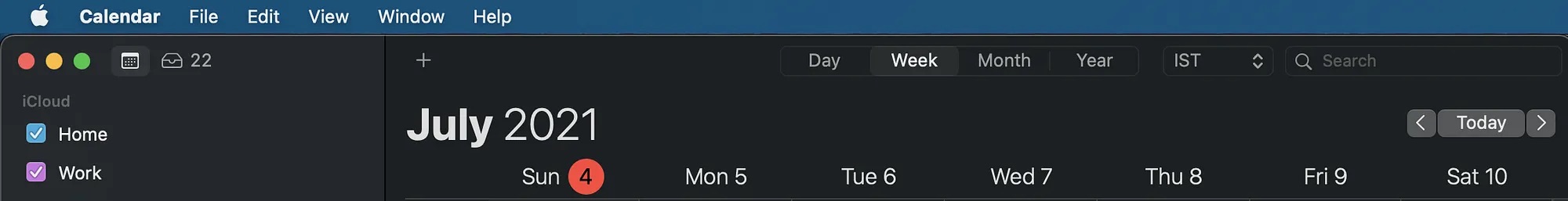
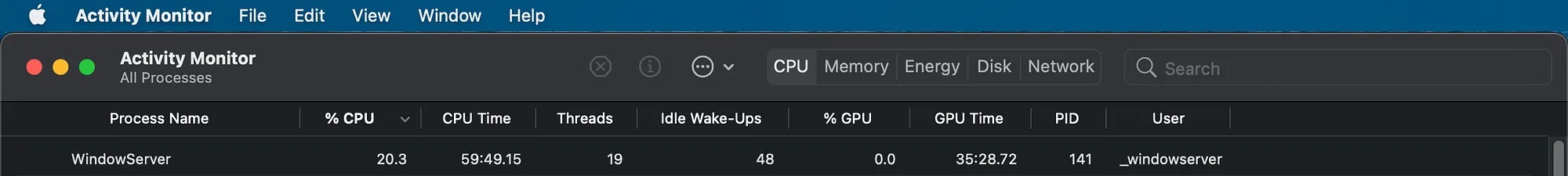
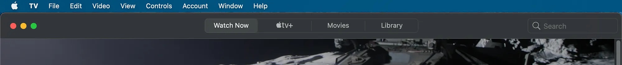
Apps like Calendar, Activity Monitor and TV show tabs in the header or title bar, each with a different tab design.
By now you must be rightfully thinking "but John these are all old screenshots, updates to Mac OS X and iOS must have addressed these issues... right?", dear reader allow me to introduce you to the UI/UX hell that is Mac OS 26 and iOS 26 that not only did not fix these issues, but introduced much worse design choices.
Don't believe me?
Take a look at the Search Bar (if one can still call it that) in Finder
I dare say, wouldn't it be rather logical to expect that an app called 'Finder'—whose entire existence hinges upon the concept of finding things—might offer a search bar that doesn't require a bloody archaeology degree to unearth? Apparently not.
But first, let's talk about iOS 26, because it's a proper dumpster fire.
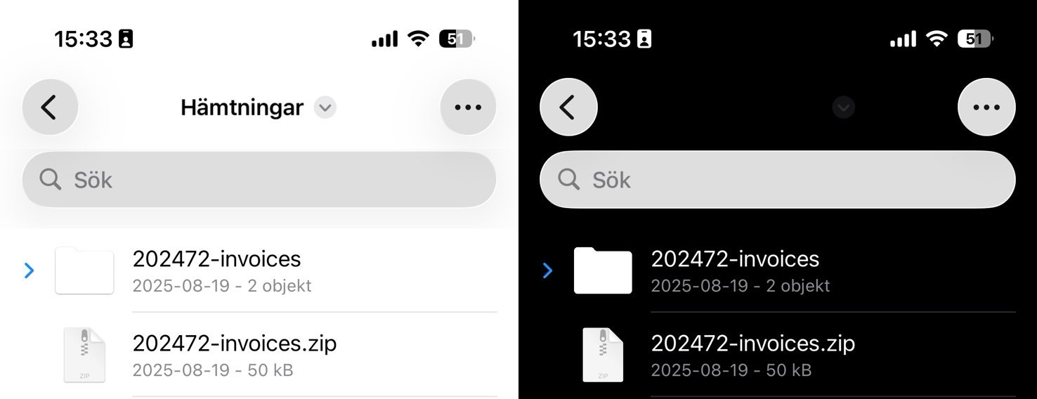
Files app
Here's the iOS 26 Files app in dark mode, and light mode side by side. Notice anything missing? Like the folder name or the barely visible down arrow? It's almost as if they haven't tested iOS 26 in dark mode at all.
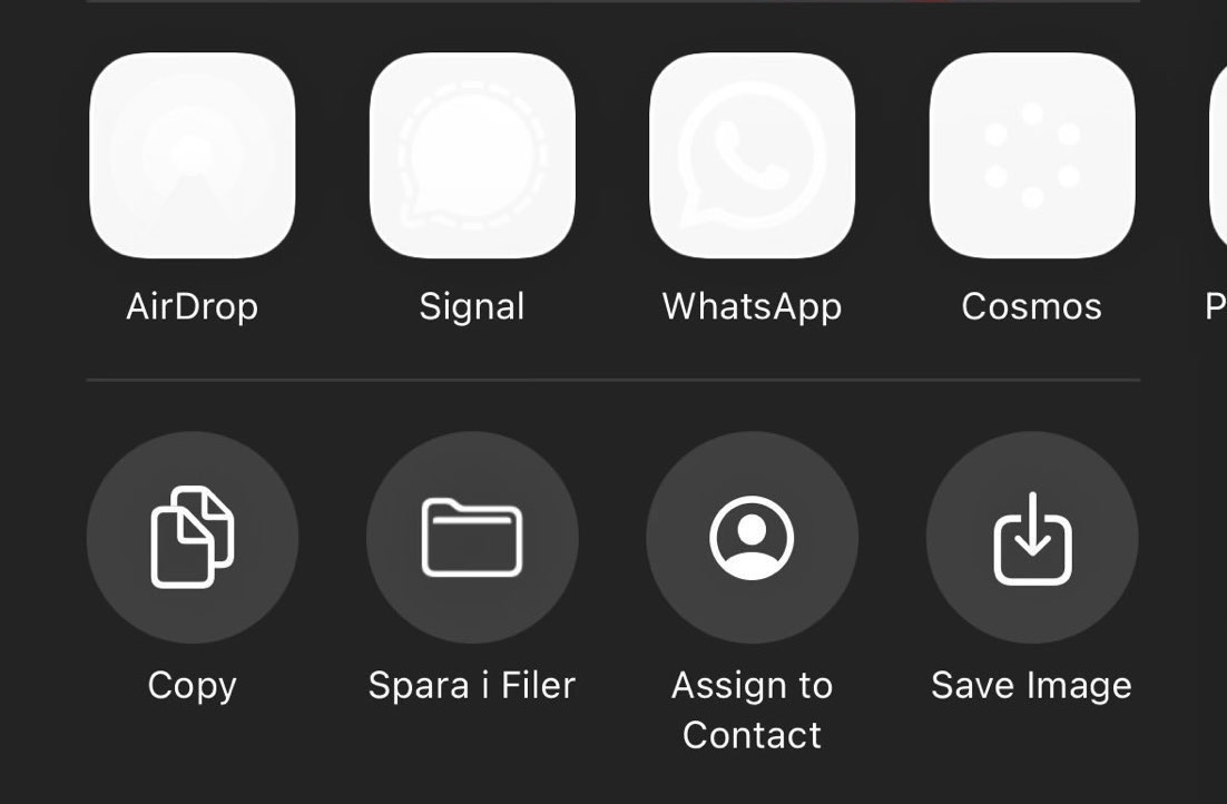
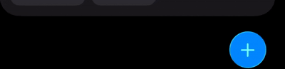
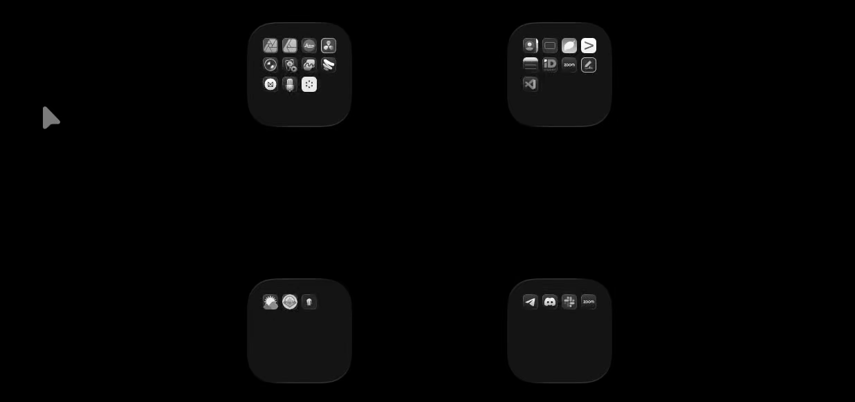
Share sheet
Immediately after updating to iOS 26, I took screen captures of all the broken things, and wanted to share them with a bunch of friends to warn them not to update. I pressed share, and this is what the app icons in the share sheet looked like :
Already off to a great start, I thought perhaps enabling / disabling the "reduced transparency" accessibility mode would solve things — just in case if liquid glass itself is the issue.
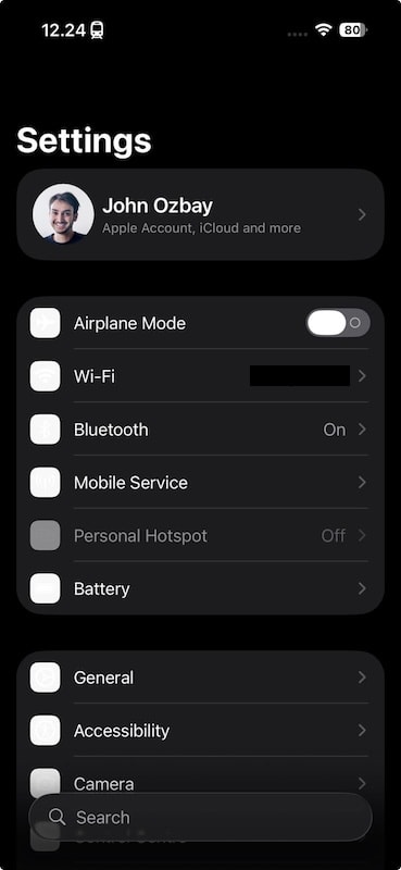
Settings
So I fired up Settings to disable transparency, and none of the icons showed up there at first.
Feeling frustrated beyond measure, I enabled "reduced transparency" mode, which fixed the icons but broke other things even further. See the black bar at the bottom behind the search bubble?

Not a huge deal when you have a massive search bar at the bottom of the screen, but it's still fugly. I thought I'd add this to my running list in the reminders app as well. So then I fired up reminders ...
Reminders
Immediately upon starting the app I noticed a very large black bar at the bottom of the screen that just wouldn't go away no matter what I did.
Alright perhaps reduced transparency broke some things... Let's turn it off, put the phone down, and switch to the iPad. That's gotta be better right?
Folders
So I grabbed my iPad, and hovered my mouse over a bunch of folders. You know, it's literally the first thing you do. Immediately noticed that the liquid glass effect wouldn't go away after a while, and I was left with shiny liquid glass folders.
I thought to myself: "perhaps I'm holding it wrong, let me fire up a browser and see if others have similar problems".
Browsers
Turns out with iOS 26, Apple broke all 3rd party browsers in thousand different ways. Why? Because WebKit has a ton of issues in iOS 26, and Apple has been forcing all third party browsers to use WebKit — I have a hundred problems with this, and I frequently talk about them in Brussels, but I'll save my energy for the next EU DMA hearing, and instead focus on other stuff in this blog post.
Let's start with a simple task shall we? Let's fire up Google using my favorite browser Vivaldi, and type literally anything into the search bar:
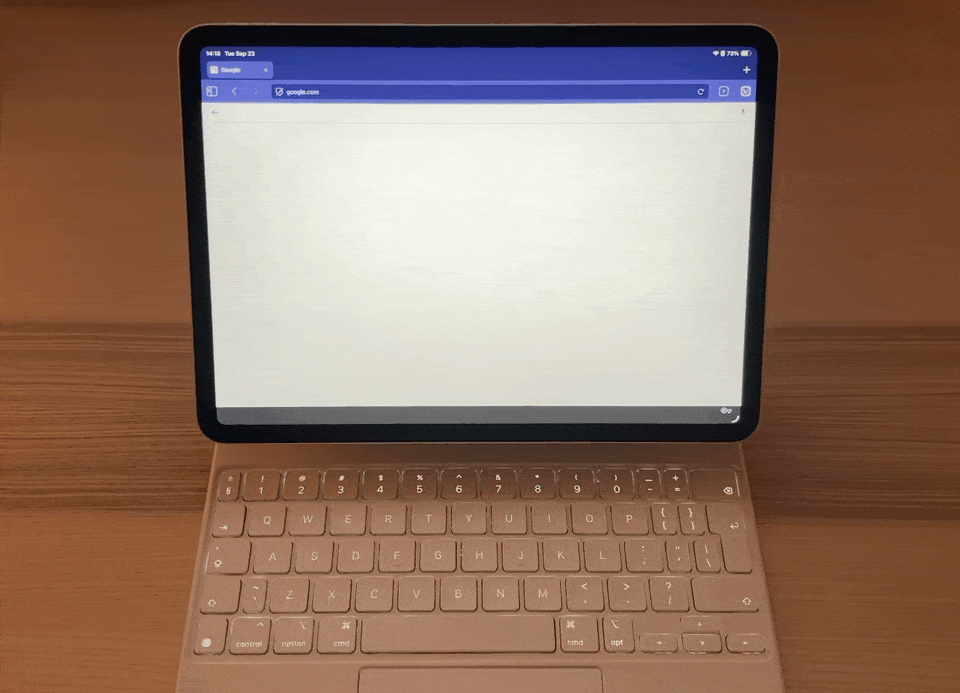
The autofill bar jumps with every keystroke. And if you're thinking "John but that's just Vivaldi" — it's not. (BTW the talented folks at Vivaldi fixed this and many other WebKit related bugs right away and it's my absolute favorite browser, you should give it a try) There's a broader issue with how Apple's webkit wants to deal with viewports in iOS 26. Let's take a look at other browsers, say for example, Apple's own steaming hot mess of a browser, Safari.
Let's count all the issues in this single 20 second long video shall we?
0:00 — 0:01
Why are all the bottom bar buttons flashing like they're sending out an SOS? (I'm guessing they're supposed to behave like the address bar but for whatever reason they don't?)
0:00 — 0:01
Buttons are white, address bar is black!
0:02 — 0:04
See buttons strangely flashing in the bottom? They're screaming for help.
0:02 — 0:04
Content scrolls behind the clock, so the top part of the browser is a complete mess
0:02 — 0:04
Content scrolls behind the buttons and the address bar, so the bottom part of the browser is a complete mess
0:00 — 0:07
The darker backdrop of Google's consent popup is cut off above the address bar.
This is because the viewport is royally fucked up in iOS 26, causing all sorts of other issues.
0:10 — 0:12
I don't know about you, but I switch tabs more often than I add pages to favorites or bookmarks. Yet, somehow switching tabs is now a two-tap action that requires a nauseating flash, with all the buttons changing colors.
So many nauseating flashy elements for no real reason.
In app browsers are an even bigger mess
Remember how I mentioned the viewport is fucked up? It expands below the bottom UI on scroll, and makes fixed elements below inaccessible.
Alignment doesn't matter
By now you must be thinking, "John, stop it—you're not that good at aligning things yourself either." Yep, but I'm also not a $3 trillion company trying to sell essentially the same $1000 phone year after year, this time with a horrible design update. So yeah, I suck at consistently aligning things myself, but I also don't need to align things as well as they do.
Now let's take a look at Safari and any other Apple app's UI side by side to better understand and confirm that Apple's design teams don't actually talk to each other. Chances are there are either multiple design guideline documents, or Apple stopped caring about design consistency across their apps altogether.
iMessages
First off Signal is awesome, it's cross platform, it's free, and you should use it with all your friends! I personally don't use iMessages, but some people do for whatever reason. Many of my friends in the U.S. seem to have some sort of unhealthy obsession with the color of their chat bubbles. Is it green or is it blue?
"Texts are green and imessages are blue, Apple loves to manipulate you!"
Executives at Apple LOVE this game of social pressure.
Can't afford a shitty $1000 iPhone? Too bad, your messages will be green, and your friends will shame you into social isolation until you buy yourself an iPhone because green bubbles are carcinogenic.
I can't believe I'm about to write this, but I think the liquid glass design team got one thing right. I think that liquid glass will end these holy messenger wars. Why? Because iMessage is absolutely trash now. iOS 26 gently nudges you to choose a background image for your text messages, which makes it nearly impossible to read the text or see photos sent to you in the messages. Where even is the input field!?!?
App Library
Don't get me wrong, I do like trillion dollar tech companies to be transparent, but this right here is certainly not what I meant when I said : "Apple needs to be more transparent". I would love to —at the very least— be able to see the icons of the apps. Sometimes they show up, sometimes they don't. Even the pigeons outside my window are more reliable than the app icons in the library.
Why this blog post?
Over the course of the past 2 years, I've spent countless hours chatting with friends trying to explain why I started to passionately dislike Apple's attitude, especially as someone who used to look up to the company. My good friend Bruce Lawson wrote an incredible blog post talking about this phenomenon, about how developers are falling out of love with Apple. I believe with the introduction of iOS 26 many designers are starting to fall out of love with Apple too. So I decided to gather some of my thoughts in this compact blog post, because why not.
Apple's design language now accurately reflects their anti-competitive shittiness. Liquid glass is like a black widow's red hourglass. Nature's way of screaming 'stay the fuck away,' but for Apple products.
Liquid glass and iOS 26 are so badly broken that I can't even possibly list all the issues I have with it. So this blog post is by no means meant to be an inclusive list, and there are at least 100 other problems.
Off the top of my head:
- notifications are practically unreadable if you have a lighter background,
- forget about using the control center, it's essentially a disco-ball.
- battery life is significantly worse for users passionately holding onto their iPhone 12 mini and 13 mini thanks to these design changes — not to mention how the new liquid glass UI doesn't scale down well for the smaller screens of mini iphones.
- goodbye accessibility
- a ton of apps like email have text-on-top-of text
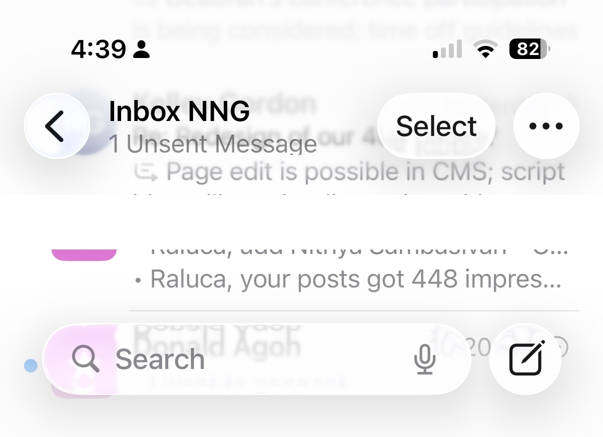
(image from Raluca's post on Nielsen Norman Group's blog)
Closing Notes
Look, I've got nothing but respect for the perfectly lovely humans who work at Apple. Several are classmates from university, or people I had the pleasure of working with before at different companies. But I rather suspect what's happened here is that some project manager got a bit too enthusiastic about hitting their quarterly targets, cobbled together some shiny mockups, and somehow managed to convince Tim and the board that this was, in fact, a brilliant idea. And apparently at no point during this process did anyone think to raise their hand and gently suggest that perhaps—just perhaps—there exists such a thing as "too much glass."